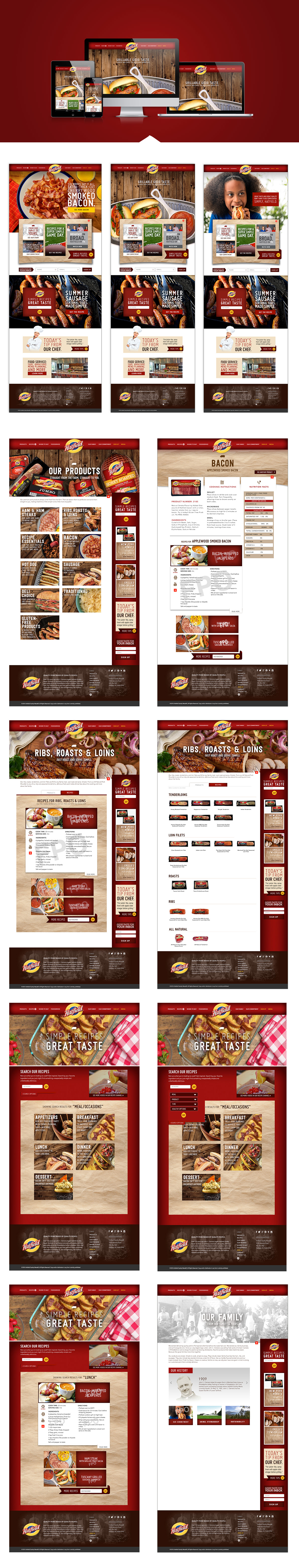
PROBLEM
Rebrand the online presents of a food icon. it must be user friendly, engaging, product driven, and accessible on all devices.
Rebrand the online presents of a food icon. it must be user friendly, engaging, product driven, and accessible on all devices.
SOLUTION
Working with the creative team I delivered a bold, user centered design. This site's framework was used as a template for the parent company's new site and two other co-brand sites. All the digital assets from where create scratch. Some base elements were pulled from in house print assets, such as color, type, texture and fonts. I also worked on post production and file prep for the development team.
Working with the creative team I delivered a bold, user centered design. This site's framework was used as a template for the parent company's new site and two other co-brand sites. All the digital assets from where create scratch. Some base elements were pulled from in house print assets, such as color, type, texture and fonts. I also worked on post production and file prep for the development team.